Amazing subtitle

For an environment where durability and security are paramount, metal provides a functional and attractive solution.
Building a new elementary school in a busy urban environment like Los Angeles comes with many opportunities and challenges. When Irvine, California-based architectural firm gkkworks was contracted to design the Sally Ride Elementary project for the Los Angeles Unified School District (LAUSD), the designers wanted to create a community asset that would be a positive improvement to the physical construct of the neighborhood while assisting LAUSD with student achievement through architecture and performance-based design.
 Before aesthetics enter the conversation, there are important functional objectives to examine and achieve when designing an urban education facility. First among these are student health, safety, and achievement. “An urban condition is coupled with high vehicular and pedestrian traffic patterns, so there is a need to manage these features effectively to ensure safety for the children on campus,” explains Jason Bone, senior project designer with gkkworks. “Part of that planning exercise is to find opportunities to replace perimeter fencing and use the building features along the property lines as a physical edge, which reinforces the city condition while providing protection to the students and campus.”
This approach proved effective with the design of Sally Ride Elementary. “With the envelope system right against the urban edge, in this case being the sidewalk, we were able to manage and enhance that edge condition,” Bone explains. “This enabled us to address the community with the right language while providing a barrier that filters urban acoustics, as well as vehicular and pedestrian activity from the classroom and campus environment.”
Vertical landscaping
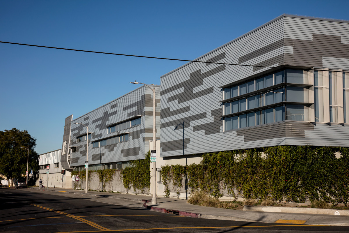
With the façade of the school being so present in the streetscape, the designers needed the right combination of materials to give the building an approachable presence while allowing it to meet the practical needs of an urban elementary school. “There is a sensibility of scale within the façade that relates to the pedestrians on the sidewalks and the students in the facility, so the lower level of the building is a stucco system cladded with a vine screen growing mechanism,” Bone says. “This allowed us to introduce new landscape that grows up the building face of the first floor to a continuous clerestory window that provides daylight into the first floor classrooms. The growing vertical landscape softens the streetscape and acts as a deterrent for the potential of urban graffiti along the ground level.”
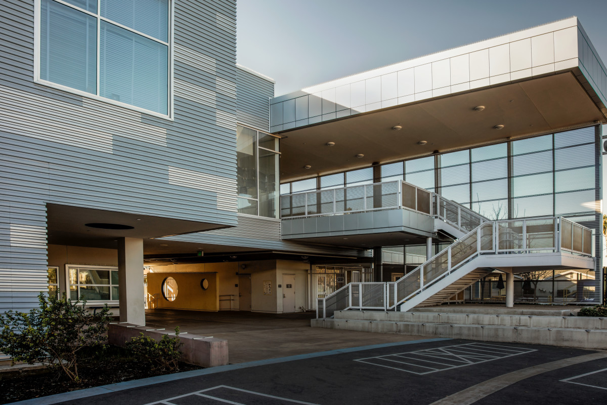
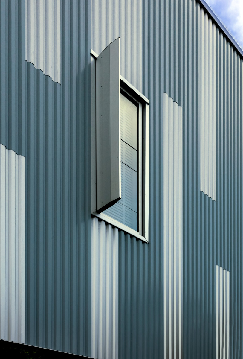 Single-skin metal panels from CENTRIA were placed on the second floor, above the clerestory window that sweeps around the entire perimeter of the building. “The metal panel system became a floating feature over the clerestory window and new vertical landscape,” Bone says.
The design team was able to give the education building a striking and unique texture by employing CENTRIA’s Concept Series CS-660 profiled metal panel with multiple colors. “We managed the project’s scale through the texture of the profile panels, due to the dynamic effects of how daylight highlights and shadows the wall surface throughout the day,” Bone says. “The metal panel system also offered the opportunity to create a custom pattern through installation of the panels themselves. We have two colors that create a visual impression to the community, instead of one solid mass of a singular metal panel system.”
The resulting pattern of metallic blue and gray metal panels creates a dynamic effect and helps the design of the school speak to its environment in a more playful manner. “We used the metallic blue and the gray because the blue reflects the notion of nature—the sky—and the gray responds to the urban condition,” Bone says. “The two color elements mixing together help to create a philosophical balance between the urban condition and the natural environment.”
The configuration of the metal panels also accommodated the daylighting needs of an educational environment. On the south elevation, the windows are deployed in a horizontal format, and on the east and west side, the windows are more vertical. “The pattern of the metal panels corresponds with the orientation of the windows,” Bone says.
The design team also made use of EcoScreen perforated screenwall panels as both an interesting façade element at the building’s entrance and a tool for controlling sunlight.
Performance and pride
Metal was able to address many functional concerns of a school in the city, while establishing a high-end aesthetic. “Some schools have a tendency to go with a singular envelope system, be that stucco or something else,” Bone says. “By balancing the proportions of the building with stucco and metal, we could create a human scale that appropriately addresses the students and community. The metal panels also reduced some ongoing maintenance issues with cracking in the stucco systems.”
Metal rainscreens can be very appealing on school projects, due to the material’s performance. It can improve a building’s energy efficiency with a favorable U-factor while reducing post-occupancy rehab issues like cracks at window lines and cracks at column lines, Bone says. On a project level, it can also speed the construction process. “When it comes to unit costs, the profile panels we used were able to compete with the traditional stucco system based on speed of erection,” he says.
 Today, the students, faculty and community have fully embraced their new facility, Bone says. “The community appreciated the school’s sensitivity to its surroundings, the high quality of the interior and exterior educational spaces, and the quality of construction. The kids love their new campus and we, the design and construction team, received several letters from students about their enthusiasm for the school they attend every day. We are very proud to have had the opportunity to partner with LAUSD, staff, and students to create an educational center for the thriving community.”


